
Summary
A pretty website is a start, but a high-converting homepage is a sales tool. To turn local visitors into clients, your site must pass the "5-second test" with a clear headline, flip the "About Us" section to focus on the customer’s needs, and provide a simple three-step roadmap to get started. By prioritizing these specialized design elements and a clear hierarchy of contact methods, you transform your digital storefront into a lead-generating machine that works 24/7.
Your website is often the first “handshake” a potential customer has with your business. But whether you are an attorney, a bookkeeper, or a home service provider, simply having a “pretty” site isn’t enough. Your homepage should compel visitors toward a phone call or a contact form or other clear next step.
Before you dive into the deep end of design, though, make sure you’ve covered the 5 website basics every local site needs, as well as designing for website accessibility and the importance of fast page loads.
Once those are in place, it’s time to look at the “anatomy” of a page that converts.
1. The Hero Section (The 5-Second Test)
The “Hero” is everything a visitor sees before they start scrolling. You have about five seconds to answer three questions: What do you do? How will it make my life better? How do I buy it?
- The Headline: State your service and location clearly (e.g., “Professional Bookkeeping in Butler County”).
- The Sub-headline: Explain the value or the problem you solve.
- The Primary Call to Action (CTA): A bold, obvious button like “Schedule a Call” or “Request a Quote.”
Why it matters: Research from the Nielsen Norman Group shows that users rarely read every word—they scan for headlines and keywords. If your value proposition isn’t clear in seconds, they’re gone.
2. The “About Them” Section (Problem & Solution)
Most businesses use the middle of their homepage for an “About Us” section filled with history and mission statements. To convert visitors, you need to flip the script: The “About Us” section should be about how you solve their problem.
“You’re here because [problem]. We help [who] in [area] get [outcome] via [process].”
Instead of leading with how long you’ve been in business, lead with how you meet your customers’ needs. Acknowledge the pain point they are facing, like the stress of tax season or the frustration of a legal hurdle—and explain how your service provides the relief they are looking for. When the customer sees their own problems reflected and solved on the page, they stop being a visitor and start becoming a sales lead.
3. The Three-Step Plan
Page designers usually overlook including this section because it is assumed that the reader knows what to do. But, if a visitor is confused or reluctant about what to do next, they’ll move on to a competitor. You can lower the barrier to entry by breaking down the process for them:
- Connect: Encourage the visitor to reach out using your preferred method, such as a direct phone call or a specific contact form. While other contact details can live in the footer, your homepage should guide the lead toward your most efficient channel.
- Meet: You meet—in person, online, by phone—to assess their needs and agree on the job or project.
- Execute: You do the heavy lifting and specialized work, relieving the customer of their pain point and delivering the result.
This roadmap removes the “fear of the unknown” and makes the path forward feel manageable and transparent. Whether you spell it out in a paragraph form or show a simple flowchart, the customer will often appreciate the prompts and direction.
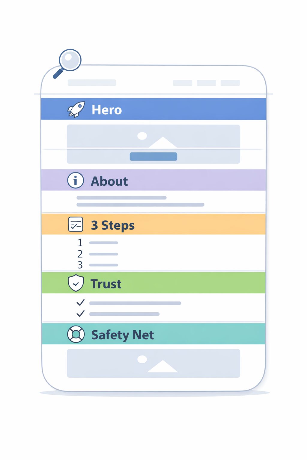
4. Social Proof and Trust Signals
While all the sections are important, this one will sway the reader. In a local market, reputation is everything. Whether you manage someone’s legal matters or their bookkeeping, you need to prove you are a trusted professional. This section should include:
- Real customer testimonials.
- Logos of local organizations (Chamber of Commerce, local associations).
- Certifications or “As Seen On” badges.
Why it matters: According to the latest BrightLocal Consumer Review Survey, the vast majority of consumers read online reviews for local businesses before making a decision. Placing these reviews directly on your homepage builds trust before they even pick up the phone.
5. The Secondary “Safety Net”
This section offers another Call To Action (CTA). Not every visitor is ready to hire you the moment they land on your site. Some are still in the research phase.
Give them a way to stay connected without committing to a full project immediately. This could be a “Free Small Business Checklist,” a “Guide to Hiring a Professional,” or a simple newsletter sign-up. This allows you to stay top-of-mind until they are ready to buy.
Final Thought: Is Your Front Door Locked?
Think of your homepage as your digital front door. If it’s cluttered, confusing, or doesn’t have a clear “Open” sign, people will keep walking. Instead, turn your homepage into a 24/7 sales tool.
Ready to turn your homepage into a lead-generating machine? Let’s talk about building a “Click Smart” website for your business.


